Categories
Inspiration

"Hong Kong Streets on Tiles" Hong Kong City Painter-Zhao Qiting

I usually paint on paper and canvas. Painting on ceramic tiles is a new attempt for Elaine. When I write, I feel fresh and challenging. The whole creative process brings her a new experience and a little new reflection.

In love with the streets of Hong Kong, Elaine has always used watercolors to document the appearance of our city, especially the streets with a taste of "old Hong Kong". For her, the effect of painting on the tiles is better than imagined, because the appearance of the street and the tiles are put together, and it turns out that they blend in just right.
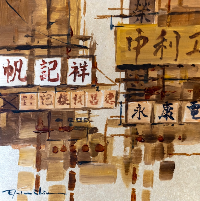
"Affected by the old street signs, I have always liked metal signboards, so I especially love the earthy color system. Using tiles of the corresponding color as the drawing board, there is no need to add more content due to the background color of the painting. The artistic conception and composition of the "blank" The sense of space on the top is exceptionally present."

In addition to the color matching, the texture of the creation on tiles is also different from the usual creation on paper and canvas.

"Some tiles are not smooth, but have unique textures, and the texture is very different from ordinary drawing boards. Such tiles, after the corresponding composition, the work will appear more real. It turns out that a painting can not only bring out visual enjoyment. , Creators can provide one more sensory way for viewers to appreciate the work-tactile rather than visual."

So, does this new creative attempt still give Elaine more new experiences?

"I have always said that I like old things. The valuable thing about old things is that we must protect them. Their fragility makes people cherish them. Or, if we don’t cherish them, I’m afraid we won’t be able to do it again soon. Seeing it. Tiles give me the same feeling. If you don’t pay attention, the creation on the brick surface will no longer be the original. Because of this, I must always remind myself that in the life of non-stop creation, I must not forget it. We must always value, stare at and cherish every work."

The possibility that ceramic tiles can be shaped has gone beyond the inherent ideas all the time!

Learn more about Elaine:
personal webpage- https://www.elainechiu.com/
Facebook- elainechiuart
Instagram- elainechiuart

In line with the faith and intention to innovate on ceramic tiles, ASA is committed to providing customers with their own style of life.

If you are interested in artistic tiles, Guanying visits Asia's flagship concept store. For cooperation on art projects, please contact 2152 1900 or 9686 6482.

(Written by: Gily Poon)

Categories
Uncategorized

香港城市畫家 - 趙綺婷

Elaine Chiu 趙綺婷

「以創作表達她對香港街道的鍾情」
生於香港、長於香港,於二零一八年,畢業於香港大學文學院藝術史系。趙綺婷的畫作圍繞城市景色,從第一身視角,刻畫個人與城市的關係。趙綺婷使用水彩作為主要繪畫媒介,透過其透明靈動的特質,渲染 出轉瞬即逝的光、影去刻畫城景。對她而言,創作像是在城市街頭上的歷險、亦像是對個人身分認同的探索,由畫作帶領大家以自身視角再次觀察我們身處城市的脈搏與心跳。趙綺婷希望以水彩創作和寫生,紀錄我城獨有的景貌、社區和文化,表達她對香港街道的鍾情。

「透過繪畫反映我城的獨有面貌」

藝術家趙綺婷透過繪畫街道中的招牌,反映香港 — 我城的獨有面貌。招牌在香港城市景貌擔當重要角色,除了指路、塑造地標等的實際功能,招牌的設計、書法字體和工藝造法,側面反映了香港人的文化、性格 和民間生活與藝術。香港的街道離不開字,街道上可以說是字、街、畫相融,充滿各類圖像化的標記。對於趙綺婷來說,街道招牌文化使她反思和探索個人文化和身分的構成,思考書法、霓虹等等對香港人視覺身分的深遠影響。

「留住最後一股回憶線索」

「對於我這樣一個九十後,第一次畫皇都戲院、與第一次畫嘉咸街街市,都是準備清拆要請願保育的時候。許多第一次繪畫的歷史建築,都是前輩寫生人帶隊去畫才認識。聽著導賞說著歷史故事娓娓道來,心中對舊時光的想像油然而生,卻感嘆自己『生不逢時』定還是有哪一種詛咒,令自己畫的東西都存在生命危機?」

Five Metals Street
五金街
acrylic on canvas 91x45cm

「奇就奇在,舊物自然產生的鏽跡、塵埃、朦朧美,讓我這種九十後有種久盼渴望的安穩感。他們說與我們這些年輕人成長的,不應該是那些摩登大樓嗎?怎麼妳都不畫畫新景象啊?

我也搞不懂,可能我五行缺金,總愛觀看鐵皮招牌;又或許我愛木給人沈穩的感覺,總對玻璃反光的物料沒有太大歸屬感,畫得不起勁,倒不如不畫了。

在我成長階段,香港城景不斷不斷在變,究竟有沒有一些符號,能讓我這輩遊牧遊民,稍微喘息依附一下?」

Timeless Treasure 美都餐室
50x60cm
acrylic on canvas
Neon Tears 德豐粉麵餐廳
50x60cm
acrylic on canvas

「畫畫,讓更我了解自己的喜惡。我偏愛使用大地色系,沉沉穩穩。層層疊疊的水跡,染出若即若離的距 離美感。我承認,我不曾屬於那個時代。但是從這個時代觀看那個時代,則產生了一股物哀感 — 安穩最終 都必將逝去,能抓住最後一股回憶線索,就好好畫下,這可能是我內心的想法。」

The Memory Lane 回憶路徑
38x56cm
watercolour on canvas

Learn more about Elaine:
personal webpage- https://www.elainechiu.com/
Facebook- elainechiuart
Instagram- elainechiuart

In line with the faith and intention to innovate on ceramic tiles, ASA is committed to providing customers with their own style of life.

藝術項目合作聯絡: 2152 1900

(Written by: Gily Poon)
Categories
Inspiration

Lifetastic 層次之美|The Beauty of Layering

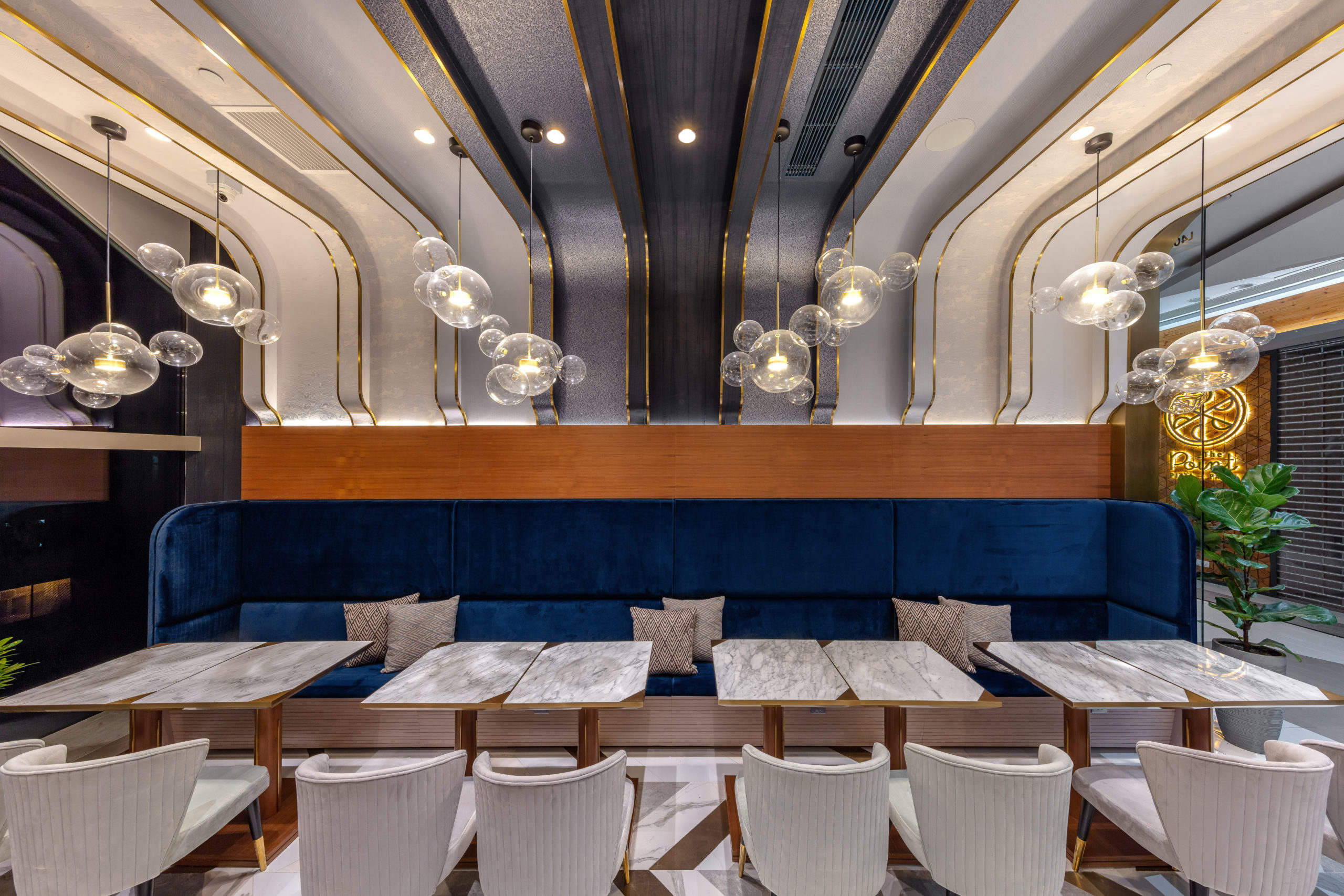
The watermelon cake craze has swept across Australia, and the watermelon cakes in Hong Kong must be reminded of Lifetastic, a unique cafe. Recently, the newly opened branch in Tsim Sha Tsui is full of design, which matches well with the fresh and gorgeous watermelon cake. The restaurant was designed by Max Lam Designs and won the "Restaurant and Bars Design Awards" and "UK A&D trophy awards, Hong Kong". The idea of Max Lam Designs comes from the distinct layering and elegant theme of the watermelon cake.

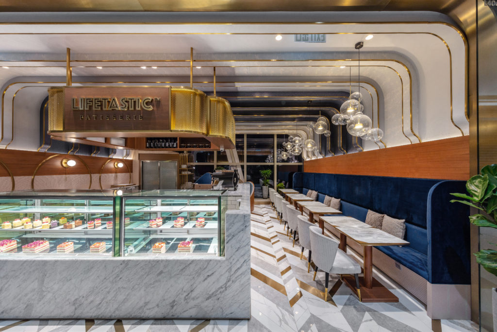
"Grand" is a feeling and a concept. The designer uses multiple layers of noble and elegant colors to match the watermelon cake with distinct layers. The floor is made of marble tiles of different colors to form an arrow-string pattern, which is gorgeous and practical, and has the function of guiding the way visually. The upper layer of the wall body and ceiling color is distinct, and the lighter and darker colors are progressive. The use of tiles of the same color creates an arc-shaped line extending from the wall to the ceiling, which merges into one.

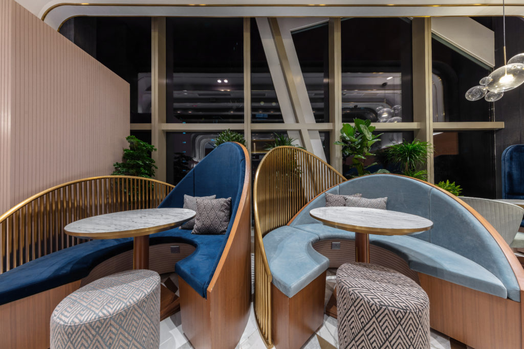
The designer cleverly used geometric elements and metal to guide the way to divide the restaurant seats into several areas to meet the needs of different guests. The sea-blue sofa area allows the family to rest and relax; the "High table" seat is suitable for couples and close friends; the VIP round table area is more private and is the best choice for friends. Different areas are connected with noble and elegant themes. The designer makes good use of various circles and arcs, and the atmosphere feels softer and more comfortable, creating a relaxing space for guests to forget their short-term fatigue.

The center of the restaurant is the food area. The design is mainly gray and white natural marble, seamlessly connecting the wall and the cake display cabinet. Marble along the grain is simple and noble, setting off the colorful watermelon cake with rich layers. The whole design shows different areas in an elegant style, and the layering of watermelon cake is assembled with simple and noble masonry paving.

ASA Tiles adheres to the insistence on quality and is committed to providing designers with materials of different styles to achieve exquisite and magnificent artworks.

Interior Design/Lighting Design: Max Lam Designs

Photographer: Dick Liu

Text: Bill Lam

Categories
Our Projects

Mount Pavilia|Clear Water Bay

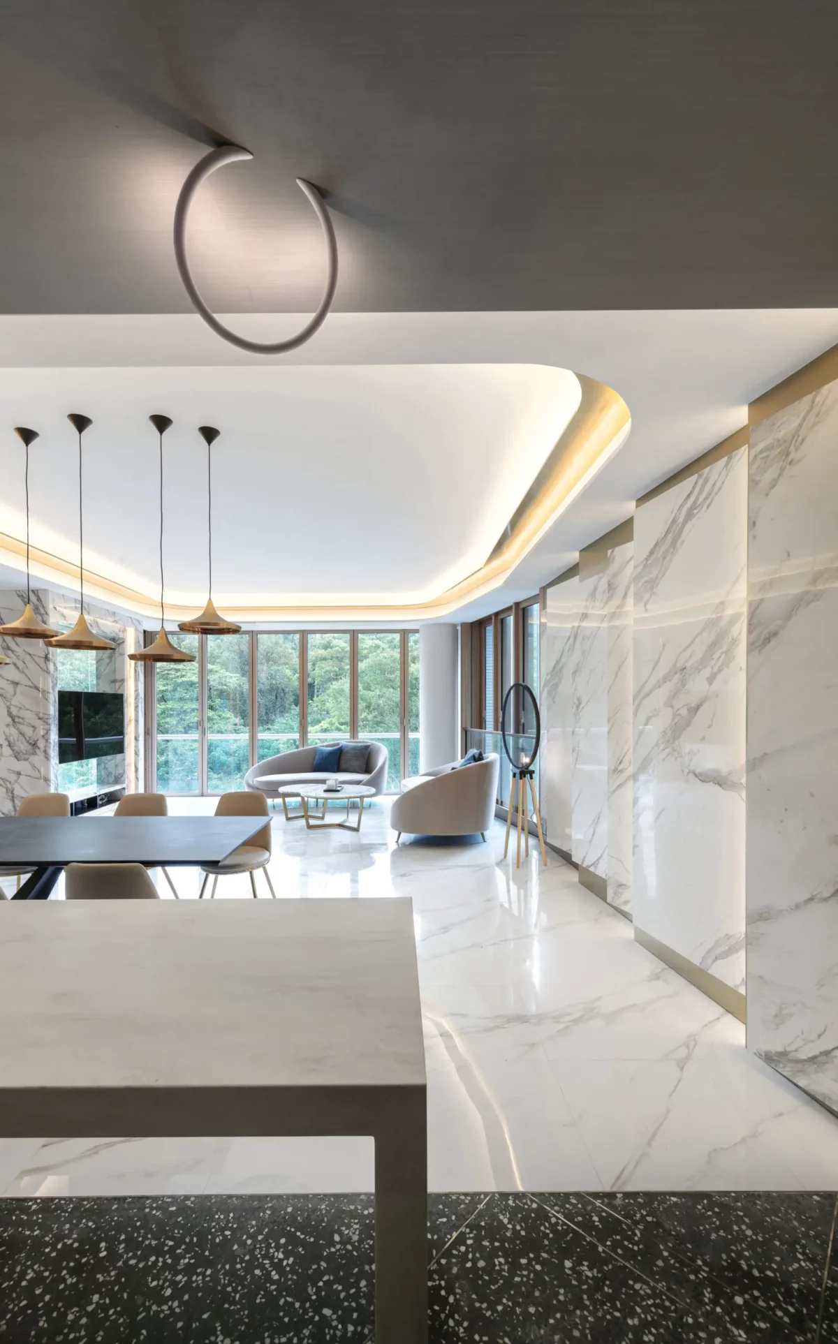
The head of the household purchased a 8,000-foot Mount Pavilia unit, hoping that the design would brighten the house. The design of the whole house is based on the theme of nobility and elegance. Simple design furniture is selected, matched with pure and endless marble patterns, and natural light sources are introduced in pure white and bright tones. Such unique ingenuity comes from RAZ Interiors, and the rich design experience of large-scale units allows the thousand-eight-foot unit to implement the noble and elegant style.

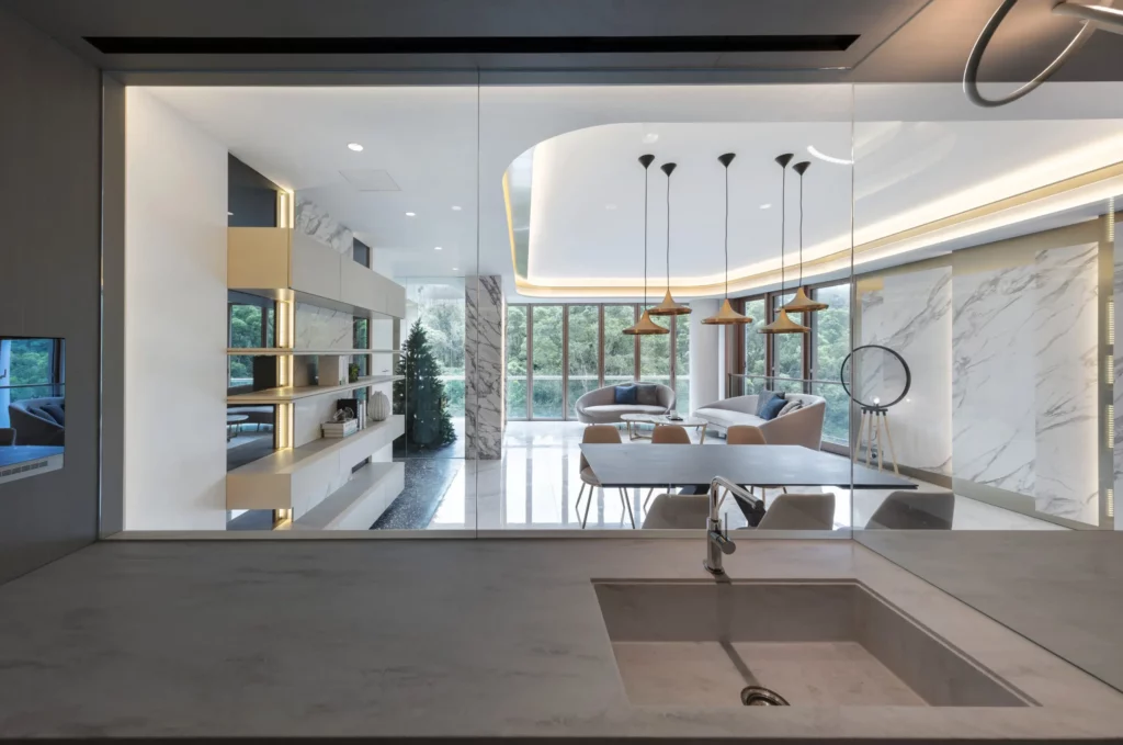
The designer cleverly used the features of the unit and used the drawings to connect the kitchen and the living room. The semi-open kitchen is equipped with flawless glass, and the living room also uses floor-to-ceiling glass, which immediately strengthens the visual extension, and is not busy looking at the mountains and forests when the kitchen is busy. In addition to the open landscape, it also doubles the sense of space.

The design of the living room is dominated by marble patterns and elegant furnishings, and the terrazzo and marble patterns are connected and extended to the entire space. The most eye-catching feature wall takes the 1.8-meter-long giant marble brick as the protagonist, and is matched with the golden background wall, which is more noble and not vulgar. The manufacture of large marble tiles is more difficult, and the requirements for flatness and surface treatment are higher than those of ordinary tiles. In addition to carefully selected materials, construction also requires experience and exquisite handwork.

The designer took into consideration the outdoor environment and integrated the green shade into the elegant and chic house. An ingenious design, the Christmas tree in the pavilion uses the principle space to highlight the advantages of the unit's height, while at the same time it can bring in the mountain view into the house and reflect each other with the shade of the trees outside the house. The Christmas tree stands in the pavilion, where you can see the green scenery from any position in the house, which achieves the effect of greening the home, and at the same time it is open and comfortable.

Based on the insistence on quality, ASA Tiles is committed to providing designers with materials of different styles to achieve noble and elegant artworks.

Interior Design: RAZ Interiors Limited