Categories
Inspiration

Kids Winshare|Reimaging Bookstore

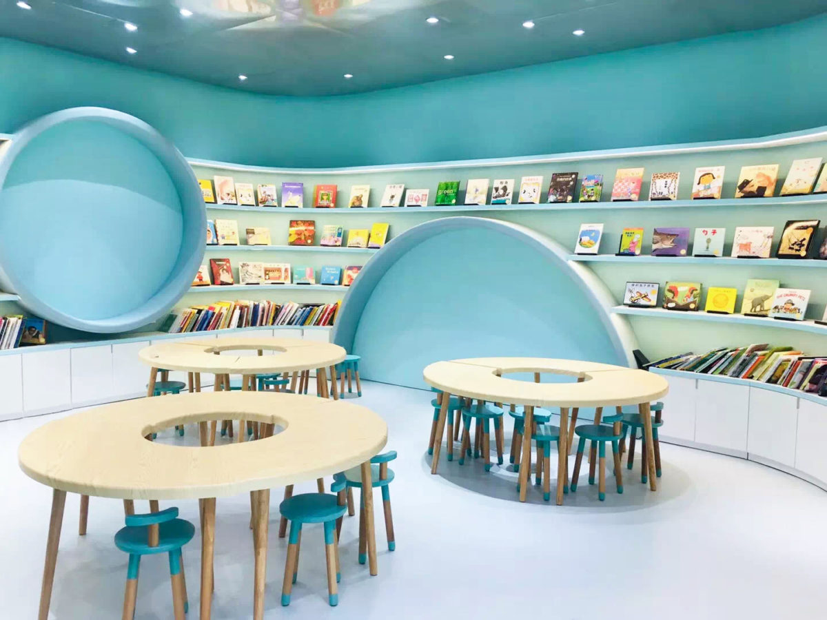
Knowledge and fun are often difficult to coexist, and letting children learn comfortably and independently is often a big problem for parents. The PANORAMA Design Group project "Wenxuan Children's Bookstore" combines knowledge and fun through innovative design, and achieves complementary effects. The design idea comes from the natural and geometric style of Joan Miro, one of the three major Spanish postmodern artists. Studies have pointed out that geometric figures are of great benefit to children's cognition, which can stimulate thinking and arouse curiosity. The designer is well versed in the relationship between environment and knowledge. The whole space is bright and comfortable. The simple circular and curved elements are cleverly used to stimulate children's infinite curiosity and imagination.

The first half of the bookstore is the reading and book collection area. When you walk into the bookstore, you will see the yellow-and-white design of the space. You are surrounded by spiral bookshelves and round pendants, and you feel like you are in a dreamy fairy tale world. A reading environment full of childishness can enhance the atmosphere of learning and attract children's curiosity about knowledge. The designer uses a pure white wall with soft lighting to reflect healthy light suitable for children's reading (appropriate floor and wall can effectively achieve bright and not dazzling lighting effects). The transparent and comfortable reading space provides children with independent space, so that children can have a process of self-searching and explore their own small universe in their reading.


The designer broke through the traditional bookstore model and designed the crystallization of technology and wisdom. The egg-shaped 360-degree multimedia projection room in the second half of the area uses an innovative multimedia projection room to show various movies and scene images throughout the sky. The children are like being on the scene, being in the real environment, which can enhance the children’s curiosity and cognition of things , Arousing their imagination. The design of the 360-degree multimedia projection room can be described as originality, creating an infinite sense of space in a limited place. The boundless panoramic projection inspires unlimited imagination.

The interactive classroom next to the multimedia projection room is different from the traditional classroom layout. The designer removed the traditional teacher's desk and added a round desk. Zero-distance teaching breaks the barrier between teachers and students, allowing children to have more space to develop themselves. Through communication with other children, learning can be combined with entertainment, which can improve children's learning interest and imagination. The entire classroom adopts blue and white tones, with plenty of light, providing a space for children to learn as much as they want. (The use of non-slip flooring can reduce the chance of children being injured during activities, so that parents can be more at ease)

The novel and personal design of "Wenxuan Children's Bookstore" allows knowledge and fun to coexist. The simple circular and curved elements and the selection of appropriate materials can achieve the best design effect. The designer’s brand-new design concept breaks through the concept of traditional bookstores, understands the needs of the new generation of children, and creates a space for them.

ASA Tiles is committed to providing designers with materials of different styles in line with the insistence on quality to achieve masterpieces.

Interior Design: PANORAMA Design Group
Text: Bill Lam

Categories
Uncategorized

「藝術應該生活化」— 年輕藝術家

近年一位年輕藝術家為香港街頭帶來色彩,亦為本地藝術帶來革新。走在街上偶爾會被震驚,在她的畫筆下,平日冰冷的牆壁丶地板和樓梯搖身一變栩栩如生的3D畫作。Terena Wong 將自己的靈感意念繪成現實,為「石屎森林」塗上色彩,增添活力。

想做就去做,走上藝術之路
藝術之路從來給人感覺不易行,需要天賦和造藝,令很多人卻步。但Terena相信只要敢想像,就能創造奇蹟。從小就喜歡繪畫的Terena於中學選修視覺藝術,隨後於大學也修讀相關的科目。即使被認為藝術之路是難走,敢想丶敢做丶敢嘗試的Terena於2017年成為美國著名街頭藝術家Tracy Lee Stum的助手,協助校園藝術教育,參與巨星Katy Perry專輯的繪畫制作,以及參加美國Street Art Festival和意大利International Street Art Painting等。一切奇妙的國際藝術體驗全因當日向Tracy Lee自薦的勇氣。

「藝術是沒有限制的」

對於Terena而言藝術是沒有限制的,接觸和參與藝術可以很簡單。在人來人往的街上繪畫街頭藝術是相當注目的,旁人也會因好奇而停下腳步,靜心觀看,也不時會有人上前提問。「其實願意去問,已經是接觸藝術,是參與的第一步。」作品太多也會有儲存的煩惱,不過Terena的作品不張於任何紙張或物料,而是任何一條樓梯丶一片磚丶一幅牆,會永遠貯藏於相機的鎂光燈下和眼睛的快門下。

「藝術應該生活化」

Terena覺得藝術應該生活化,能為「石屎森林」帶來活力。顏料並非繪畫的唯一元素,白紙亦非畫作的唯一媒介,但憑自己的巧手和熱誠,Terena創作了屬於自己的藝術和風格,在不同的地方留下足跡,讓沉悶的石牆也可以絹麗地細訴自己的故事。

撰稿留言:Terena Wong ‧ 一位年輕藝術家,本著藝術無邊界的理念,不拘繩墨,將藝術帶到牆壁丶樓梯丶地板等建築。

藝術項目合作:2152 1900

(撰稿:Bill Lam)

Categories
Inspiration

Life is like seeing for the first time (Part 2)

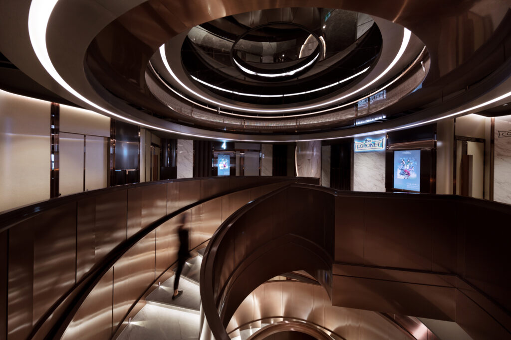
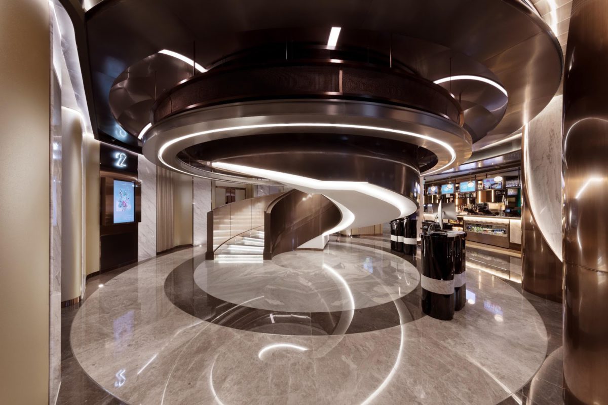
It was drizzling, and I met him to watch "Aladdin" at the entertainment theater. The cinema has two floors, each with a lobby, connected by a row of magnificent spiral staircases in the middle. Like floating in the air, it not only maintains the flow of space, but also allows light to pass through the opening of the stairs, making the space bright and open. The spiral form has a powerful attraction. When you stand at the midpoint of the spiral, looking up or overlooking, you will see fragments separated between the stairs, like an infinite corridor, which makes it easy to recall the past.

The spiral staircase represents the discussion stage before designing and drafting the draft, gathering and sparking more interesting ideas. The audience can walk from the third floor lobby to the fourth floor from the stairs, walk in the whirlpool, plunge into a deeper imagination, and prepare for entering the movie world. This vortex is made up of multiple materials: black ceilings, hidden lights, copper-colored stainless steel plates and trims, metal plates, white paint, and gold-bronze railings. Both lobbies use black metal painted panels, wood veneers, nickel-plated stainless steel counters, white marble veneer walls and beige leather walls. Use the glossy and matte characteristics of these different materials to create pencil marks with different shades. The catering department on the third floor uses black and white and has straight lines. The counter is composed of white marble, hidden lights and copper mirrored skirting boards. The countertop is made of white steel, dark white wax and stainless steel edges. There is more straight-grained glass beside it, which is bordered by black stainless steel, and irregular rectangles are juxtaposed. The counter is covered with gray tiles and bright round light bulbs, illuminating the strong pencil sketch style.

Rotate along the stairs to the lobby on the fourth floor. The color is slightly changed to mainly gold and bronze, gradually leading to the coloring stage after the pencil sketch. The counter on the fourth floor is composed of straight-grained white marble and wooden veneer walls. It contrasts with the curve next to it, which can highlight the free spirit of the sketch. (Choosing high flatness and non-slip tiles helps maintain an elegant posture on the magnificent stairs)

The bathroom also uses pencil sketches as the main tone, and uses various shades of gray to express. Materials include black painted ceilings with hidden lights, stainless steel edging, gray wood veneers, gray-black tiles, white gypsum board ceilings, white glossy glass, gray floor tiles, and so on. Use a variety of similar but different materials, because even as simple as a pencil drawing, complex and tedious skills and materials are required. The lines in the bathroom are sharp and straight, as if after careful calculation, every stroke and every line is extremely accurate.

Ken has always studied wine, and is meticulous in the design of the bar area of the theater. Use lighting brightness, color distribution and other elements to enhance the beauty and mood of the space. There is a lot of knowledge in this.

Finally, I came to the viewing hall, where the colors are finally enriched, deducing the coloring stage of the draft. The seats in the two typical theaters also mix dark blue, dark gray, and brown, but the colors of the walls and carpets are slightly different. The walls of one of the auditoriums are mainly blue with a touch of green and covered with a gray-black carpet; the other is mainly green with a touch of purple and covered with a brown carpet. The walls of all viewing halls have a neat curve, concealed with soft lighting, and are surrounded by dark gray wood veneer plywood. The neat black lacquered ceiling tiles make the decorative curve of the wall more obvious the flow of space.

The straight and curved lines of the entire movie theater stand independently under the spotlight, indicating the freedom and boldness of imagination in the sketches. Because the original intention of creativity starts from expressing ideas bravely.
Drafting, design, sketching, sketching

First draft・finished product, first final・original intention

As a movie lover, some will choose to write film reviews, and some will choose to do film production. Theater interior designers are relatively unpopular. They had never thought about theater projects one after another. Once it was done, it was 6 years old. CM believes that as long as they do not follow the trend, the brand positioning is solid enough, and the quality is maintained, and the original intention is firm, they will definitely be able to break out of their world.

Postscript: I think a carefully designed theater can sublimate the entire experience of watching movies. In August of this year, the Oft Interior team will have another new work released. It is expected that the largest UA cinema in Hong Kong will open in the third quarter of this year at K11 MUSEA in Tsim Sha Tsui. From November 12 to November 17, K11 MUSEA will also hold the Cannes Film Festival Festival de Cannes Film Week, which will screen 6 of the official selections of the Cannes Film Festival in France this May. I really look forward to it!

Written by: Steph. M

Categories
Inspiration

Life is like seeing for the first time (Part 1)

I have lived in Western District since I was young, and I have always envied my classmates who live in Taikoo Shing because there are theaters in my own community! Today, the development of the Internet has changed our entertainment habits. The physical big screen is no longer the only way to enjoy movies. Watch online 24 hours a day on mobile phones, computers, and iPads. But I always think that the original feeling and atmosphere can be found in the theater. The expansive picture and stereo loopback stereo equipment is absolutely unmatched at home. Laughing and crying together is also the place where love sprouts must be checked.

Among them, the Emperor Entertainment Theater in Central is my favorite cinema. Amidst the rush of people going to and from get off work, stepping into the entertainment industry feels like a sense of relief, and it instantly makes people enter the atmosphere of watching movies. This theater is exactly the work of the designer of Oft Interiors.

They imagined that if these years are reproduced in a quick mirror, I believe that there must be many plans and drafts that pass quickly. Numerous changes and amendments, the draft paper, pencils, and erasers scattered on the workbench confirm the foundation of the interior design, which is also the first stage of the film: the sketch. The drafting stage is an indispensable and important stage for any creativity and design. Only with sketches can the imagination be gradually presented. Film workers often prepare Story Boards before shooting, and carefully draw the storyboard, shooting angle, location, and clothing. But who said that the draft can only stay at the first draft stage? The beauty of sketches is easy to be overlooked, but what it expresses is the purest and initial touch.

I am reminded of the sentence in "Mulan Ci Ni Gu Jue Jue Ci Yu You", "If life is only like first seeing", many people would be as good as they were when they first saw it... If only seeing it for the first time, all the good things will not be lost. It was amazing at first sight, goodbye still.

Written by: Steph. M

Categories
Inspiration

Girl's den

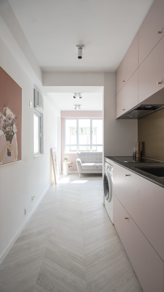
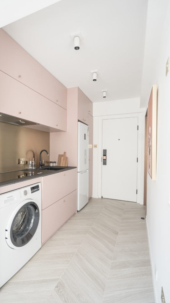
The average unit size in Hong Kong is not large. Whether you will buy a 200-foot dwelling or a 2,000-foot detached house in the future, you will want the decoration and design to be neat and tidy, and the home looks comfortable and spacious. How to plan the home to increase the sense of space in the unit? Designer Leo Tam is good at matching colors according to the guests' preferences, and adding some technical changes to make the unit more space-like.

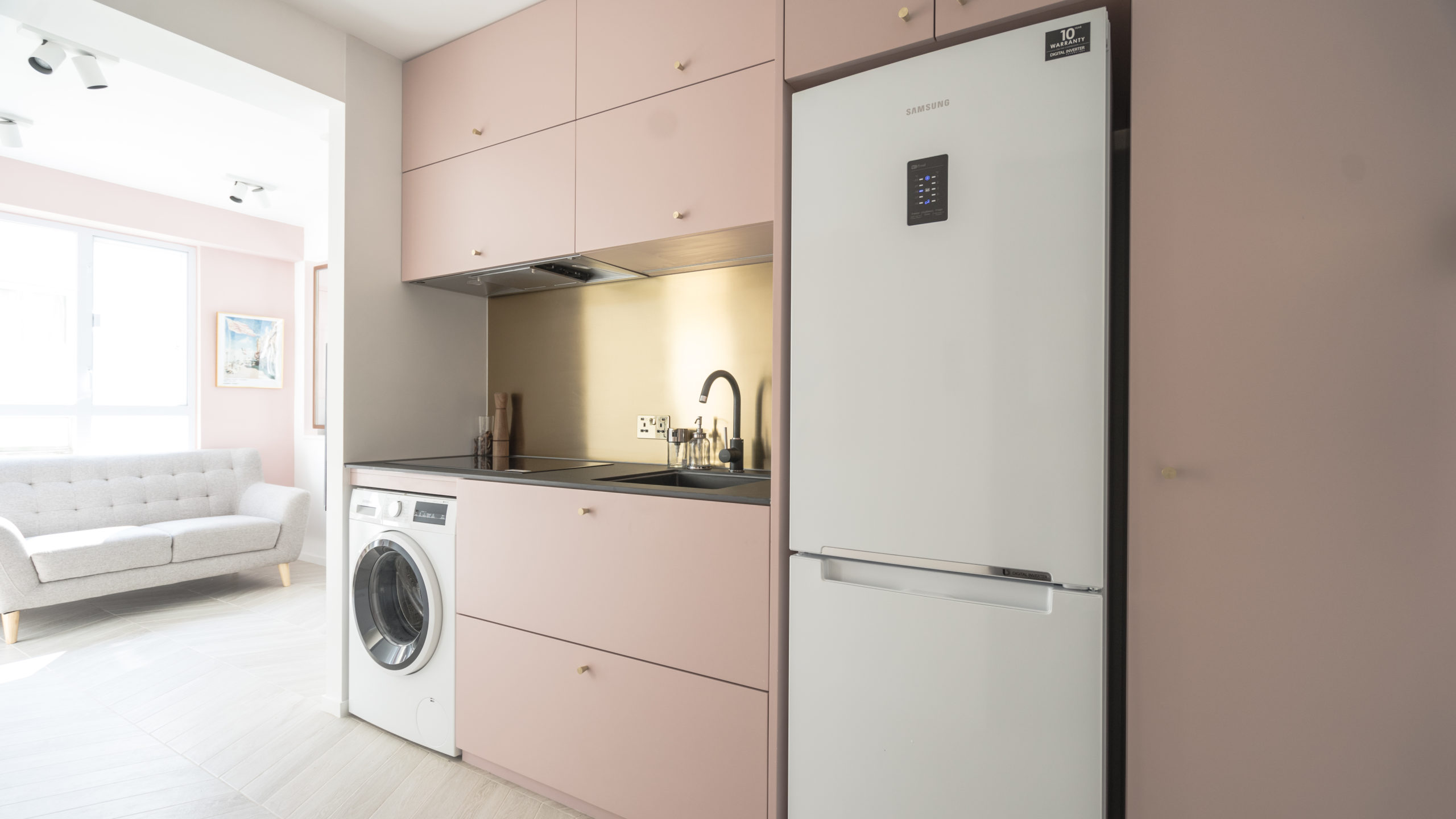
Leo's case this time uses a warm, soft and romantic gray-pink theme to transform the residence into a private check-in location.

Due to the limited area, in order to expand the space, Leo thought of changing the open kitchen to the doorway, cleverly separating the kitchen and the living room, but also adding a visual sense of space. Sitting on the side of the sofa, you can also see the people who cook, making the relationship closer!

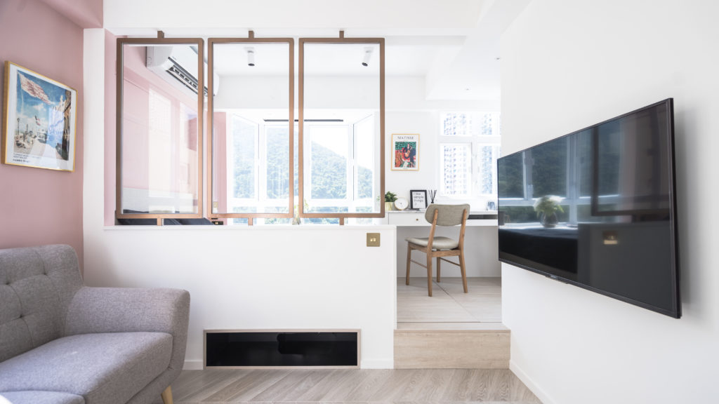
The original kitchen has been changed to a wardrobe, which allows the owner to have more storage rooms, especially the piles of clothes for girls. The closet is connected to the workbench, and the bed constitutes the space of the master room. Coupled with the design of the floor, it can be used to distinguish the space without the seemingly narrow gap between the door and the wall.

The use of glass allows light from different angles to be fully projected into the house, and it can double the sense of space in the living room and room.

On Sunday afternoon, the sun went into the pink cabin, and then lay on the bed and watched the TV in the living room for a while, and then looked out the window. It is so happy to be able to enjoy the lazy moment like this!

Asia is committed to creating a happy home for you.
The case provides:Leo Tam

(Written by: Asher Cheung)

Categories
Uncategorized

「在藝術中尋找盼望及傳遞愛」 ─ 從幼教走上藝術路

「想透過畫畫將安慰及盼望帶給這個世界,也帶給自己。」
這是Haley的初心,亦是她的堅持和目標。  

踏上藝術路

原職幼稚園教師多年,毅然走上截然不同的路,全因在創作中找到世間的色彩。手執起十多年沒觸碰過的畫筆,順著靈感及深刻的思想,畫作完成了,亦就此定下決心往藝術方向走。

《冷街窄巷》
他們正在暗角裡獨自痛哭,在黑夜裡絕望無助。他們的眼中,白天、黑夜,同樣沒有光、沒有夢。然而,祂明白,因祂也同樣走過這段路。 「人子來,為要拯救失喪的人。 For the Son of man is come to save that which was lost.」 他們會得到真正的救贖,願這成為人們最深的禱告。    

從專屬的手工藝開始

Haley選擇以手工藝起步 ─ 於首飾及手機殼上繪畫。以小小的空間作畫紙,想展現的信息卻宏大。首先了解別人的故事及想法,再把當中的思想以畫表達出來,從而創造出每個人獨一無二的專屬產品。整個過程中所花的時間不只於動筆創作,還需用於互相溝通及了解。正因如此,每一件作品所帶出的意義更貼近人心。

《絕處的花》
看似脆弱,卻是頑強;外表渺小,卻是強大;從不爭豔,卻是美麗。似乎生不逢時,卻是造物主親手栽種的,溫柔而堅壯的花。    
《I Could Have Danced All Night》
假使我快樂,我大概會跳舞,自由地、如風、如歌般旋轉,直到飛上天空,變成藍天和白雲。也許你以為我是鳥,其實不是,我不過是個女孩子。  

把愛灌入藝術

建立品牌的社交平台、於D2 Place的市集參展、開辦水彩畫班及工作坊… Haley一直為自己開拓更多可能性。把藝術融入生活中的各種細節,不但增添美感,更加添了靈魂。在所有情況下都致力為客人獻上一幅觸動人心的圖畫,願以此帶出一份獨一無二的愛和祝福。

「你是獨一無二,值得被愛。相信,愛,就是最真摰的藝術。」

撰稿留言: 問及Haley還想怎樣介紹自己,她說:「我喜歡看樹,因為當我仰望,就愈發現自己渺小。這使我渴望長得更高,看見更多。」願這位喜歡看樹的女孩,在這條藝術路中能夠茁壯成長,成為一棵堅壯的大樹,把更多的愛以藝術傳播開去。

了解Haley更多:

Facebook – https://www.facebook.com/beloved1million/

Instagram – https://www.instagram.com/beloved_million/

本著信念和用心在瓷磚上的革新,ASA致力提供屬於客戶自己的生活風格。

如對瓷磚藝術有興趣,觀迎親臨亞細亞旗艦概念店參觀,藝術項目合作聯絡: 9686 6482。

(Written by: Gily Poon)

Categories
Uncategorized

《彩色的童話王國》

從小就愛看安徒生的童話故事,因而一直對哥本哈根—這個安徒生居住的地方有著濃厚的興趣。還記得踏入哥本哈根的第一下感覺,整個人都頓感輕鬆自在。比起從前到遊過的其他歐洲國家,這有「童話王國」之稱的地方真的有種讓人莫名快樂起來的魔力。

我並沒有刻意安排一堆行程,只想著必定要去看看那一排彩色房子,畢竟我也是衝著它們而來的,哈哈!這排彩色房子的所在地名為新港 (Nyhavn)。新港是一條能把海水直接引進至國王新廣場的運河,從前於17世紀時是丹麥的一個繁忙港口。

旁邊的彩色建築同建於17世紀,著名的童話故事作家安徒生亦曾居於這裡。當地人告訴我,若有興趣的話可在18號、20號及67號房子「打卡」,那便是安徒生居住過的地方。現在的新港,旁邊林立著餐廳、咖啡店及酒吧,更有「全世界最長吧枱」的美譽。除了是遊客的打卡聖地,同是當地人一家大小聚餐見面的地方。

在哥本哈根逗留了四天,總共往新港跑了三次,幾乎每天都得去看一次。頭兩次都是個晴天,這排色彩繽紛的房子在藍天白雲下可說是大放異彩,尤其在哥本哈根,大概也只有這裏充滿了暖色系的建築。並排在一起的房子在不同暖色的搭配下顯得相當配襯,絲毫不見突兀,不但能看到它的美,更能感受到它滲出的陣陣暖意。我想這排房子本就是個藝術的創作,是件亮眼又溫暖的藝術品,隨便執起相機一拍,都能拍出如畫一樣的美景。

第三次是個不時下著微雨的陰天,我也趁著這個機會去看看在不同天氣下,這排彩色房子有何不同。在烏雲密佈下,它確實多少也減了些色彩,增添了一種淡淡的哀愁氣氛,但亦無減讓人猶如處身在童話世界般。這亦理應歸功於其顏色的運用,暖色系的配搭總不至於帶人冰冷的感覺。我忽發奇想,就像安徒生的童話故事亦非總以同一框架的歡樂作尾,在不同的天氣及光線下映照出相似而不盡相同的感覺,這也算是別有一番味道吧。

猶記得當日觀光船導覽員說過一番話:「哥本哈根是個很小的城市,小得所有景點基本上都能途步前往,但若你沒有到新港感受過,你便不能說自己來過了。」這大概說明了,無論從前或現在,這色彩斑斕的地方,都是哥本哈根最傳奇的故事。本著信念和用心在瓷磚上的革新,ASA致力提供屬於客戶自己的生活風格。

(撰稿: Gily Poon)