Categories
Our Projects

 Bel-Air|Pok Fu Lam

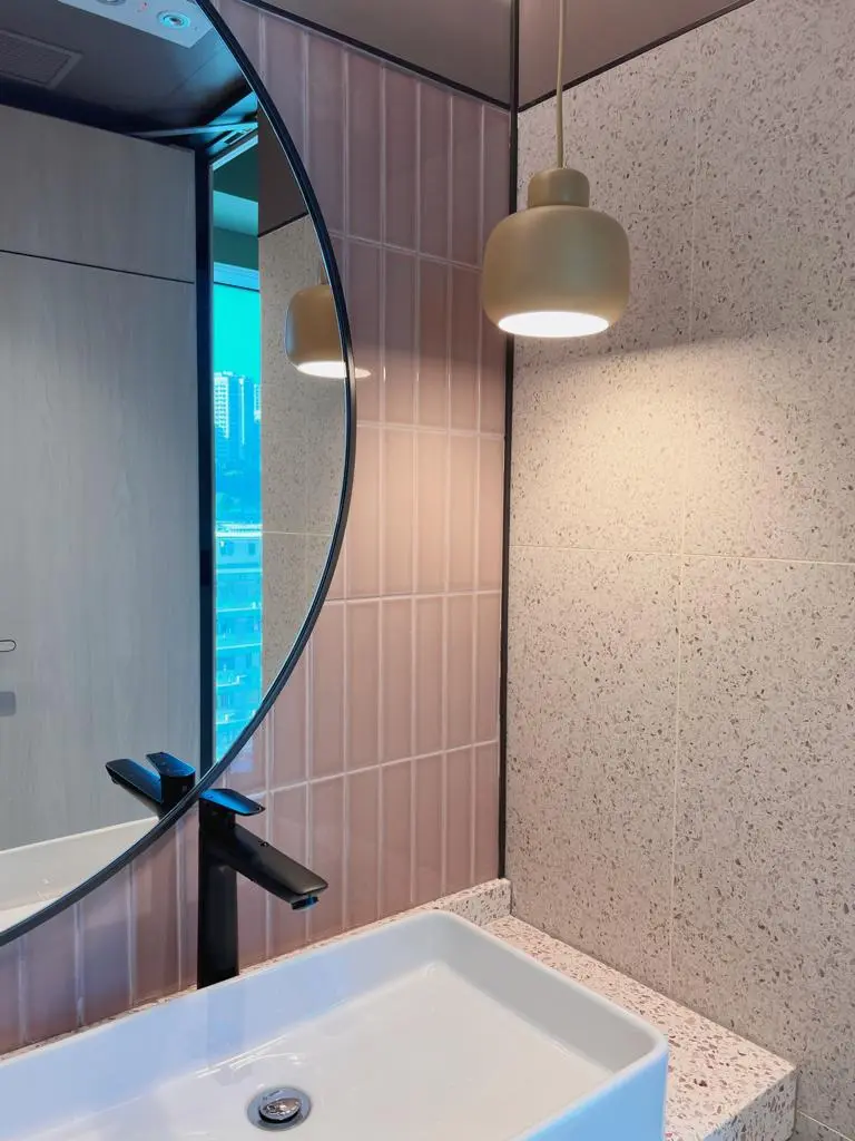
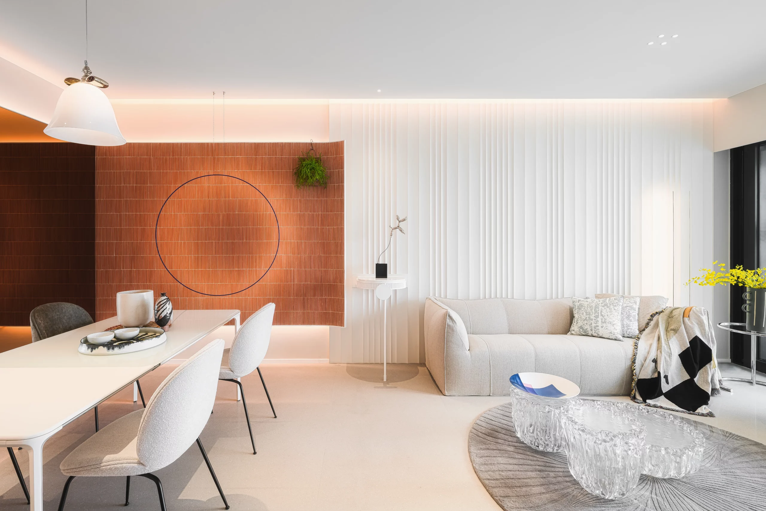
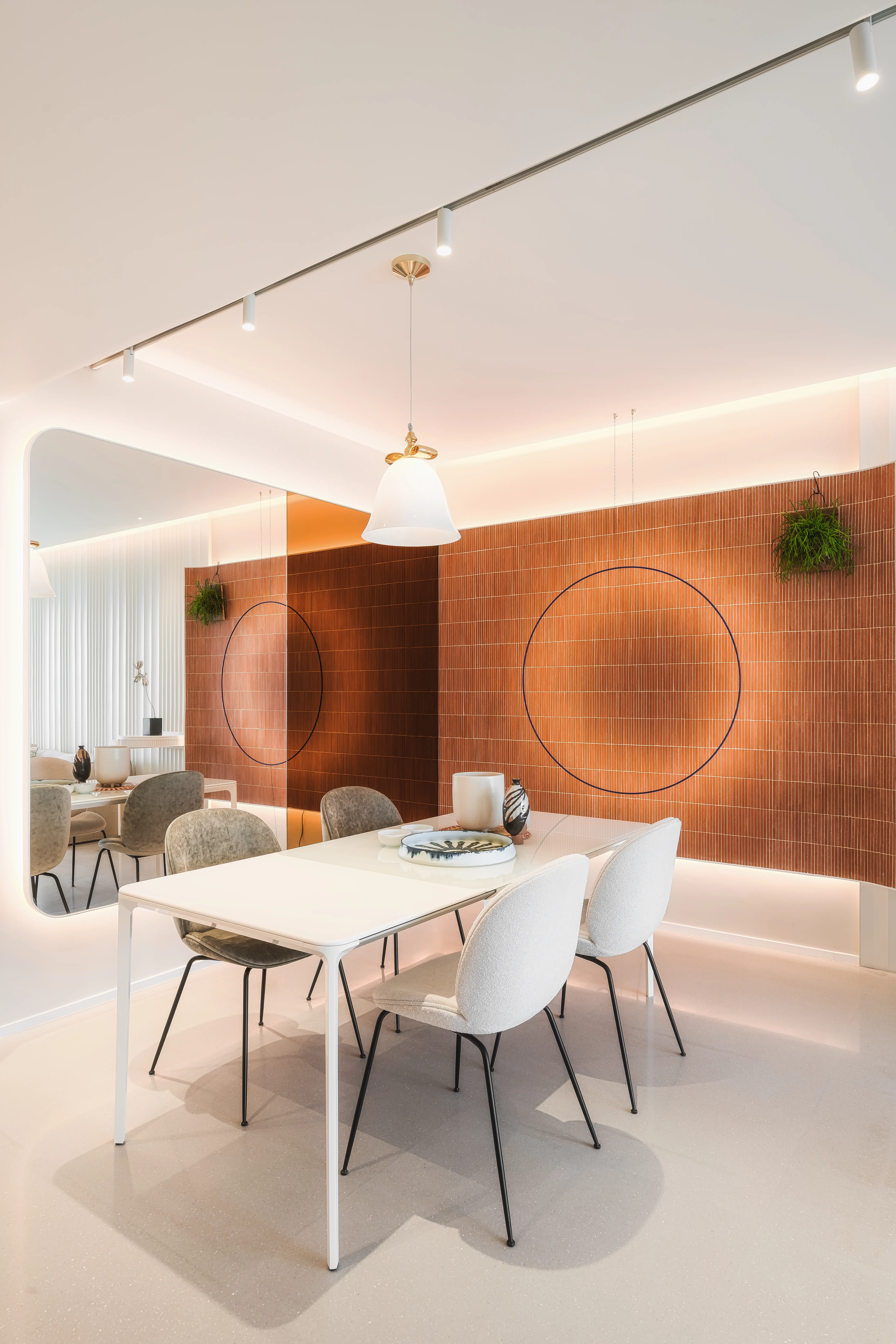
Bel-Air is a residential estate located in Pok Fu Lam, Hong Kong, boasting magnificent unobstructed sea views. The designer has infused new life into this one living room and three-bedroom unit through a meticulous redesign. The unit features a predominant milky white color scheme. To address the lack of natural light in the dining area, the designer boldly incorporates brick-red ceramic tiles and orange mirror screens to enhance the lighting. Additionally, ASA gray-toned terrazzo tiles are used to balance the colors of the walls, creating a significantly enhanced sense of space.

In addition to pursuing aesthetics, the designer also considers visual comfort. The kitchen floor is adorned with ASA gray-toned terrazzo, ensuring that the illumination from the ceiling lights does not overly strain the eyes, reducing fatigue.

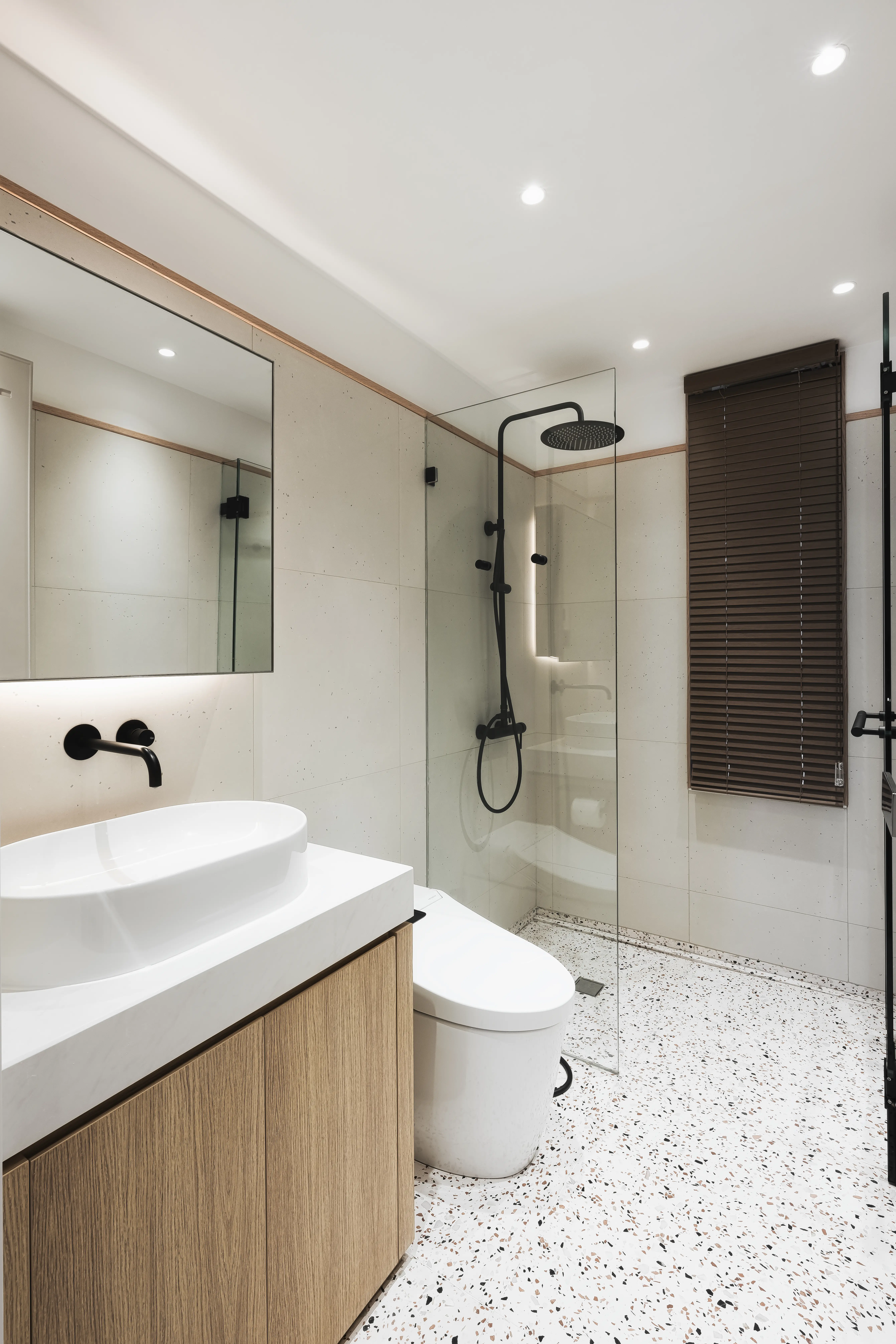
The bathroom's wall design is kept simple, and a prominent grainy terrazzo floor in a beige tone is chosen to prevent the environment from appearing monotonous.

Design: PplusP Creations Limited

Categories
Our Projects

 Hana Sakazuki|Causeway Bay

 Having served countless patrons high quality Japanese dishes for almost two decades, Hana Sakazuki strives for excellence not only in the kitchen but also in the dining areas to offer a visual feast on top of a culinary one.

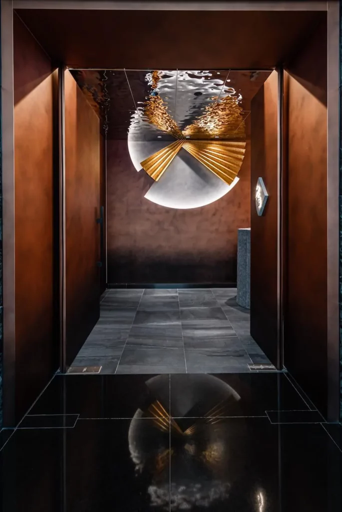
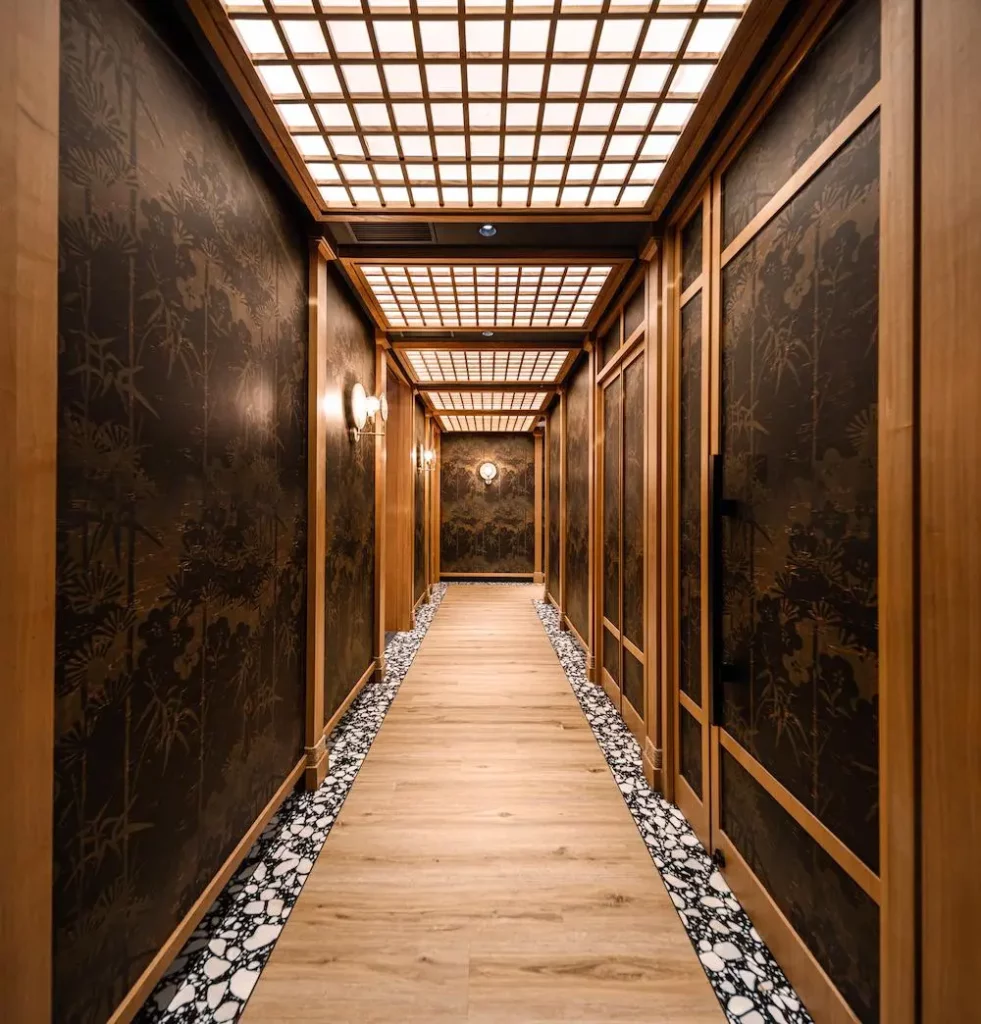
An extraordinary lighting centrepiece, with incredible linear and shape irregularities, in the VIP room immediately draws our attention. Inspiration is drawn from the intricate architecture of traditional Japanese Noh theatre. Here, surrounded also by vintage, majestic style wallpapers, the chef takes centre stage serving only the best culinary creations.

Here the designer opted for dark grey ASA Stone-Inspired Tiles for the flooring, creating a striking juxtaposition with the other design elements in the room and retaining a level of balance between opulence and coziness. The thoughtfulness of this design choice cannot be overstated, and is felt throughout the entire dining area.

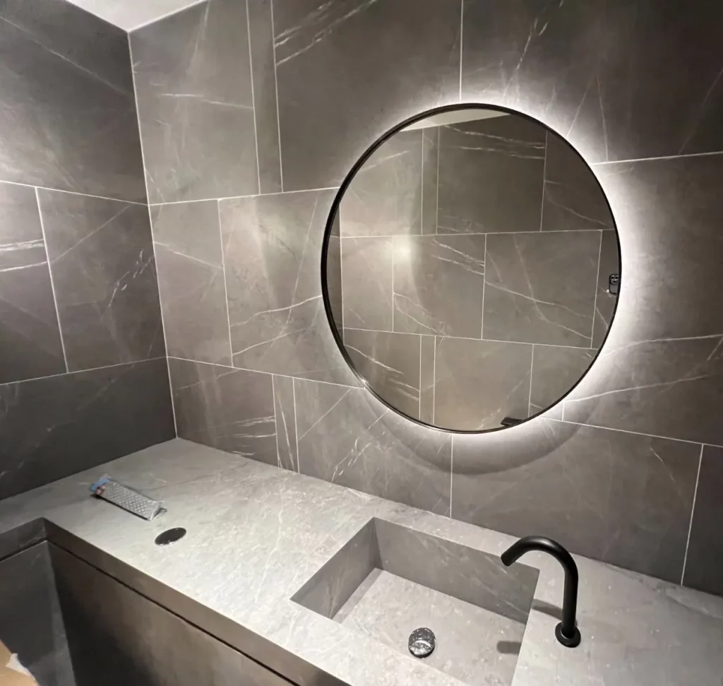
ASA Exquisite Marble Tiles, handpicked by the design team, with subtle yet natural patterns perfectly complement the overall relaxed vibe and practical functionality of the restrooms. Different materials are put together as pieces of an intricate puzzle. Marble veins, going into all directions, form the base on which this maze of a wall is built. Coupled with the circle shaped mirror, the designer stretched our imagination while deploying all significant features of ASA Exquisite Marble Tiles.

Design and photo credits to: Greyscale

Categories
Our Projects

La Viña|Causeway Bay

Discover the Beauty of Tile Artistic Cutting

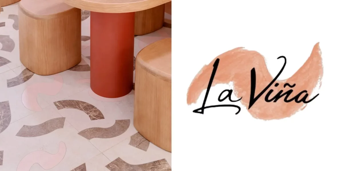
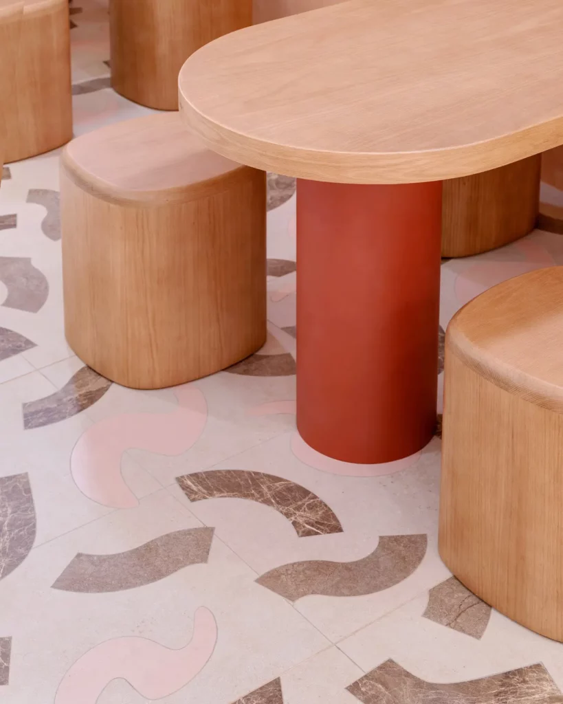
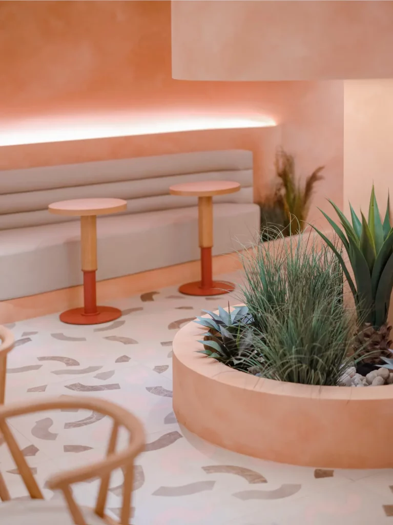
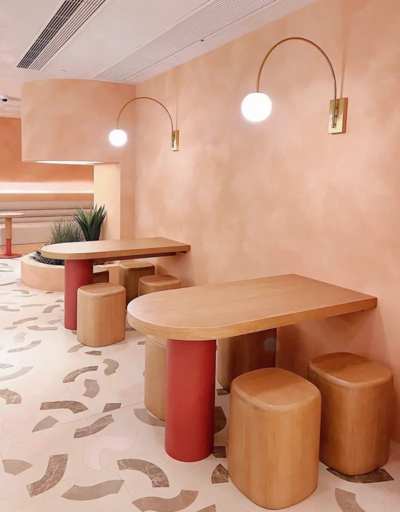
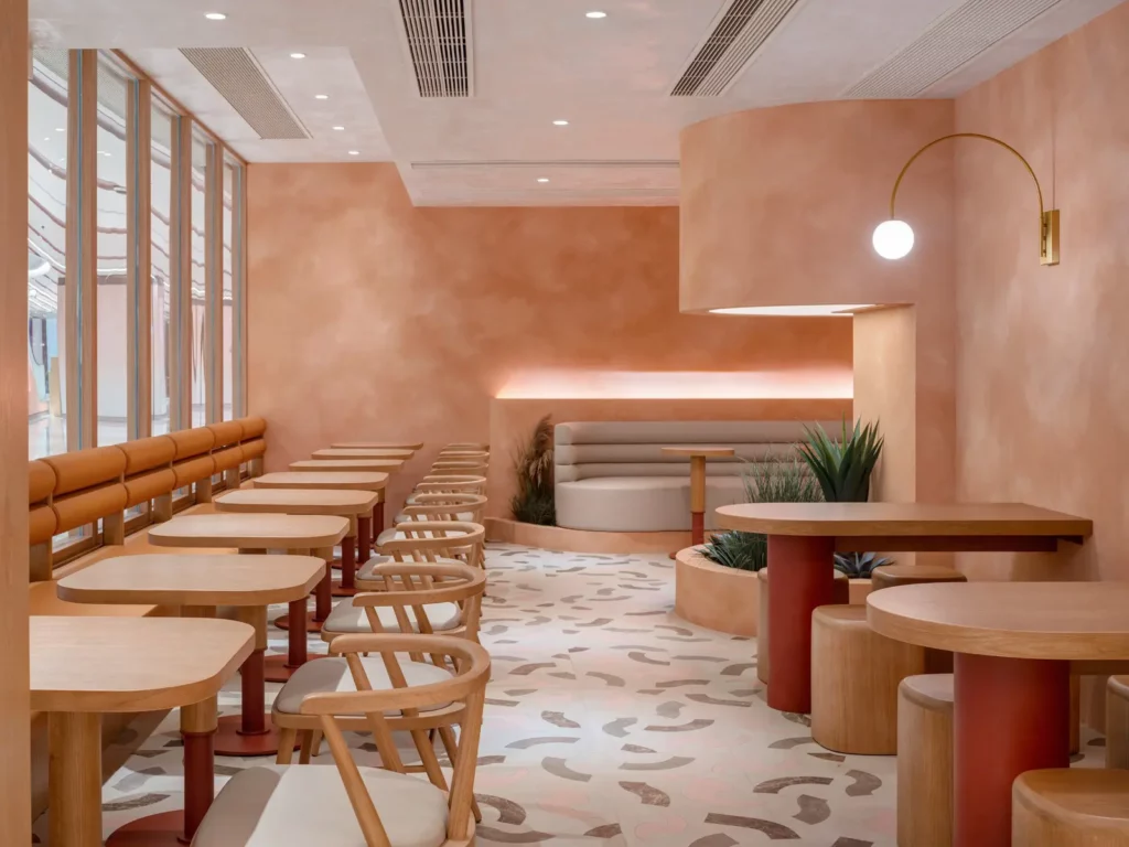
At the latest branch of La Viña, nestled in the bustling World Trade Centre at Causeway Bay, an immaculate space awaits. Artistic cutting tiles, crafted with the utmost care and precision, are a marvel to behold. The designer's choice to combine four distinct shades of pink tiles to reflect the brand’s logo on the floor filled the cafe with a captivating and unique style that exudes an irresistible aura of charisma and elegance.

The gentle and subtle hues of the tiles create an ambiance of unparalleled comfort and relaxation. Each piece of artistic cutting tiles radiate vitality and creativity, imbuing the entire space with infinite inspiration and beauty that reflect the designer's impeccable artistic visions.

La Viña's clever use of soft lighting throughout instills a sense of warmth and comfort reminiscent of the coziness of home. Thoughtfully spaced curved seats and tables invite guests to recline and unwind while enjoying their meal in complete comfort. Every design detail is polished with exquisite taste and sophistication for customers to discover and relish.

With such refined elements La Viña offers a perfect backdrop for capturing unforgettable memories. This artistic atmosphere is bound to leave an indelible impression of timeless elegance and boundless inspiration that will linger long after the visit.

Photo credits: Unite Unit
Categories
Our Projects

Peko Peko Eatery|Taikoo

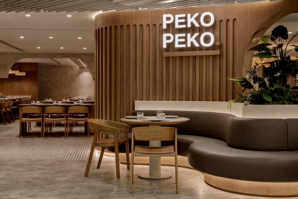
Peko Peko Eatery, famous for their Japanese-Western fusion creations, recently opened their third restaurant at Kornhill Plaza, Taikoo. The design of this new outlet mirrors the chic and minimalistic Japanese aesthetic found at all their branches.

Peko Peko is decorated primarily in a sophisticated warm grey tone, forming a space with depth, nuance, and complexity. An impeccable balance is struck between the eye-catching bold patterns of the terrazzo floor tiles and the modest, natural colours of the entire area.

The Eatery is topped off with wooden furniture pieces, echoing the theme of honouring Japanese culture. Blending familiar wooden materials and unorthodox elements, this space does not lose its character while providing a cosy ambiance for guests to have a hearty meal in.

Categories
Our Projects

M Square, WM Hotel|Sai Kung

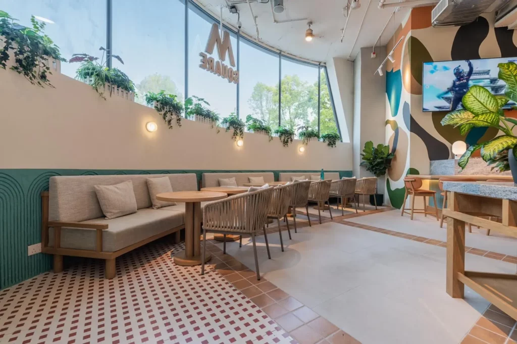
WM Hotel is an extraordinary hotel located in Sai Kung. Apart from being a little paradise away from town, surrounded by greenery and near the waterfront, it is also a well developed facility where you can spend your holidays enjoying different kinds of outdoor activities.

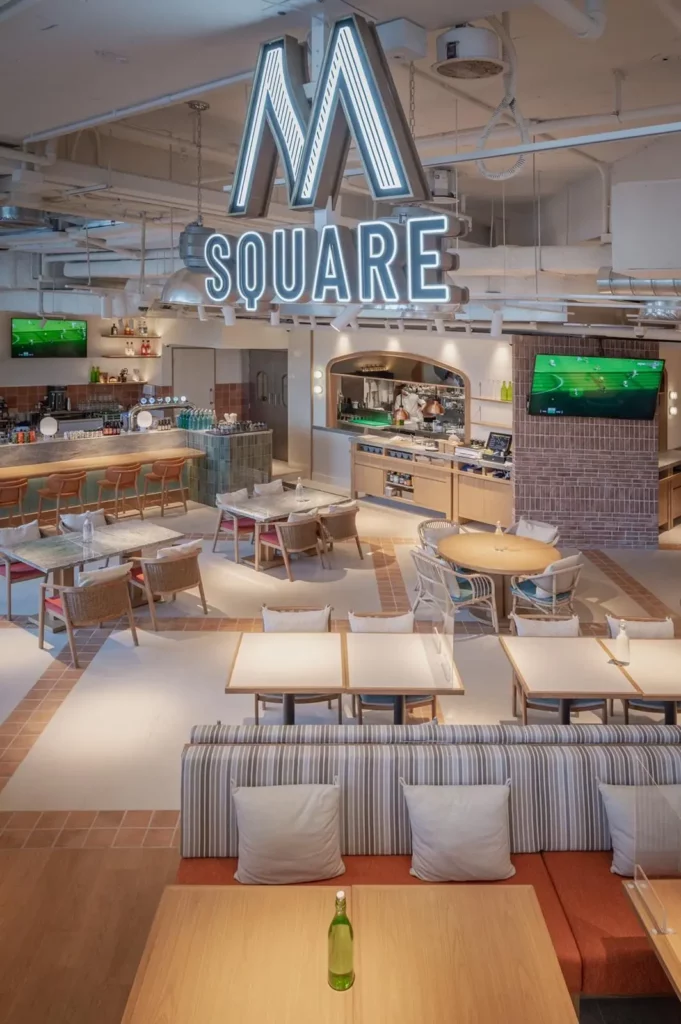
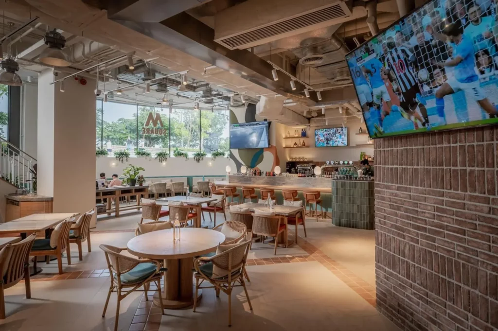
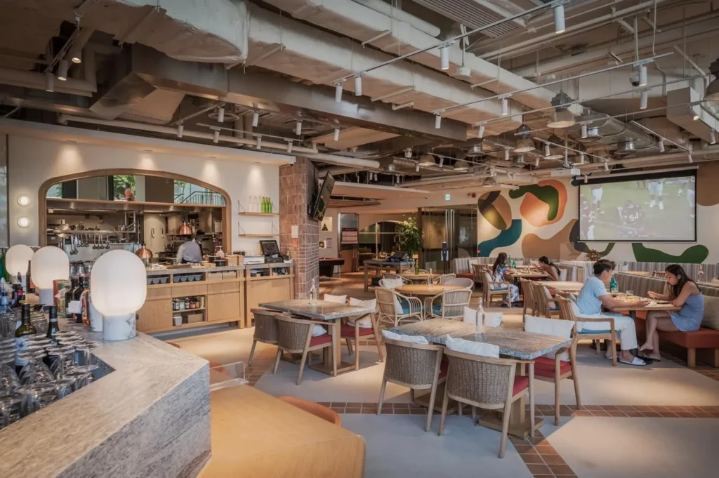
M Square Sports and Grill is a perfect venue for the entire family, with a spacious area of around 5,800 square feet. You can choose to go for a friendly game at the golf and snooker zones, or watch live sports on TV while enjoying a delicious meal.

Designed by I II Concept, this dining venue embodies the beach lifestyle. Its unique vitality immerses guests in the present moment with an eclectic and contemporary design. A Custom-Made Mosaic floor created from products from our VersaTiles series perfectly complement the island getaway vibes of Sai Kung. Handmade tiles behind the bar also contribute to bringing the nature to this incredible space.

Credit to: I II Concept

Categories
Our Projects

Shikigiku|Central

Renowned for its world-class tempura, Shikigiku Japanese Restaurant offers an opulent Japanese dining experience at their newly furnished location at ifc. Their remarkable repertoire includes authentic sashimi, sushi, teppanyaki, and kaiseki made only from the freshest and most nutritious ingredients. Each dish at Shikigiku, ifc is perfectly paired with the stunning views of Victoria Harbour.

Apart from serving exquisite Japanese food, Shikigiku, ifc also celebrates Japanese culture with their interior design. The design team at Steve Leung Design Group, inspired by the traditional Japanese “Furoshiki” art style, decorated the restaurant mostly with simple and natural wood tones.

A truly unique flooring was created from combining two products from our Timber Tiles collection. After going through a meticulous Artistic Processing procedure, the tiles pattern resemble a traditional Japanese knot (組紐くみひも). The love for Japanese elegance is not only reflected on the plates but on the floors, bringing the dining experience to a whole new level.

Categories
Our Projects

HKJC Shop|Central Stanley Street

A major 11-month renovation has been completed at the Hong Kong Jockey Club Central Stanley Street Shop. This branch has been hailed as "the luckiest", having produced 47 first prize winners since 1994, the most out of all HKJC outlets. This four-story Stanley Street Shop finally reopened as an experience shop, similar to the LOHAS Shop that opened last year. The Club strives to offer its customers an entirely new entertainment experience with integrated catering, leisure and digital betting services all in one space.

With its convenient location near Lan Kwai Fong and in the heart of the Central business and entertainment areas, Stanley Street Shop makes it easy for friends to get together for happy hour or after work. They can watch live racing and football broadcasts while enjoying good food in delightful restaurants. It is not to be missed, as the shop offers social festivities, food, entertainment, and excitement.

We are delighted to participate in this project. Our signature timber and artistic tiles are designed to make the ambience more enjoyable, giving the place an exquisite look with the colour combinations. It has been a wonderful experience collaborating with Hong Kong Jockey Club.

Categories
Our Projects

Lady M|Central

Hong Kongers with a sweet tooth went into a frenzy when Lady M opened their first outlet here back in 2015. Seven years on the famed New York patisserie shows no sign of stopping; their newest branch has just arrived in Central.

With generous lighting and minimalistic furniture, customers feel right at home while having all their sweet cravings satisfied. The flooring of this spacious eatery features light beige ASA Timber Tiles meticulously laid in a herringbone pattern. It adds complexity and flair to the otherwise simple design but does not distract from the focus of the place: the cakes.

Photo credits: Ibi Group Holdings Ltd

Categories
Our Projects

Strawberry Hill|The Peak

Located on the secluded Plantation Road on the Peak, Stawberry Hill houses feature spacious outdoor areas best suited for enjoying the breathtaking views of Victoria Harbour. The brilliant team at Darren Design and Associates was tasked with choosing tiles that could withstand different weather conditions and extend the minimalistic yet elegant design theme to the outdoors. 

To complement the house’s off white exterior, the design team selected, from our Versatiles collection, light beige homogenous tiles for the main outdoor area. The different stone-pattern faces of this product add a splash of pattern to the simplistic style of the house. 

The design team did not leave functionality behind – its strong R11 slip resistance and homogenous nature are guarantees of durability. With such features the garden makes for a perfect venue for the owners to host their friends and family.

Design: Darren Design and Associates  

Categories
Our Projects

Aromatic Scent|Bath and Body Works Tung Chung

Bath & Body Works, an American body care brand, is widely popular among Hongkongers and has currently opened a few branches in the city. The second branch is now open at Citygate in Tung Chung following the Shatin store. ASA Tiles is fortunate to have taken part in this project, providing timber tiles as floor tiles for the new store.


The brand colour of Bath & Body Works is blue, which is considered a cool colour and applied by the designer as the main tone of the store’s decoration. On the other hand, mild warm colours bring people a pleasant mood and vitality. Hence, timber tiles of warm tone were handpicked to pave the store floor, lighting up the entire space. The designer hoped to create a warm and comfy feeling to the store, sticking to the business objective of Bath & Body Works: “make the world brighter, happier place”. The blue ceiling and the light brown timber floor tiles also make an interesting match.